PHAIDON PRESS | Visual Identity
The challenge for this project was to design an identity for Phaidon Press that embodied the future aspirations of this global
book publisher.
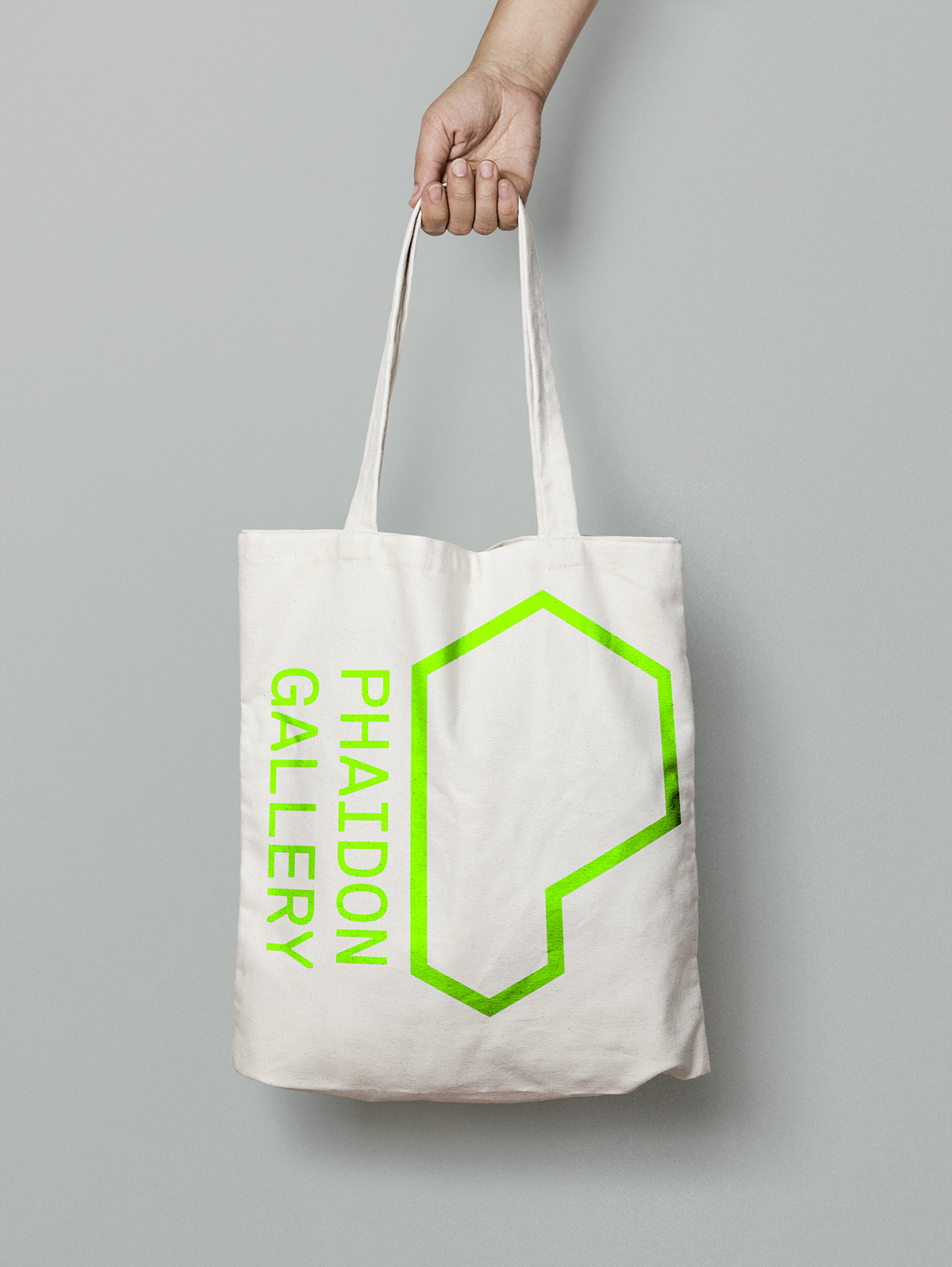
The new identity expresses the personality of Phaidon while also allowing the company to communicate with a younger generation of book lovers through clarity and bold visual impact. The concept of the iconic “P” is based not only on the word that makes up the organization's name but also on the ¶ character, which indicates the beginning of a paragraph. Conceptually, the beginning of a paragraph is a metaphor for the beginning of several stories, and these stories are as diverse and interesting as the company that represents them.
This identity is designed as a flexible system and may transform whenever applicable as a way to speak to the several fields in which Phaidon acts. This flexibility also aims at the creation of a community around its products and services; proud customers/members of the Phaidon community may come together for special lectures, gallery shows, and other cultural events carried out by organization.
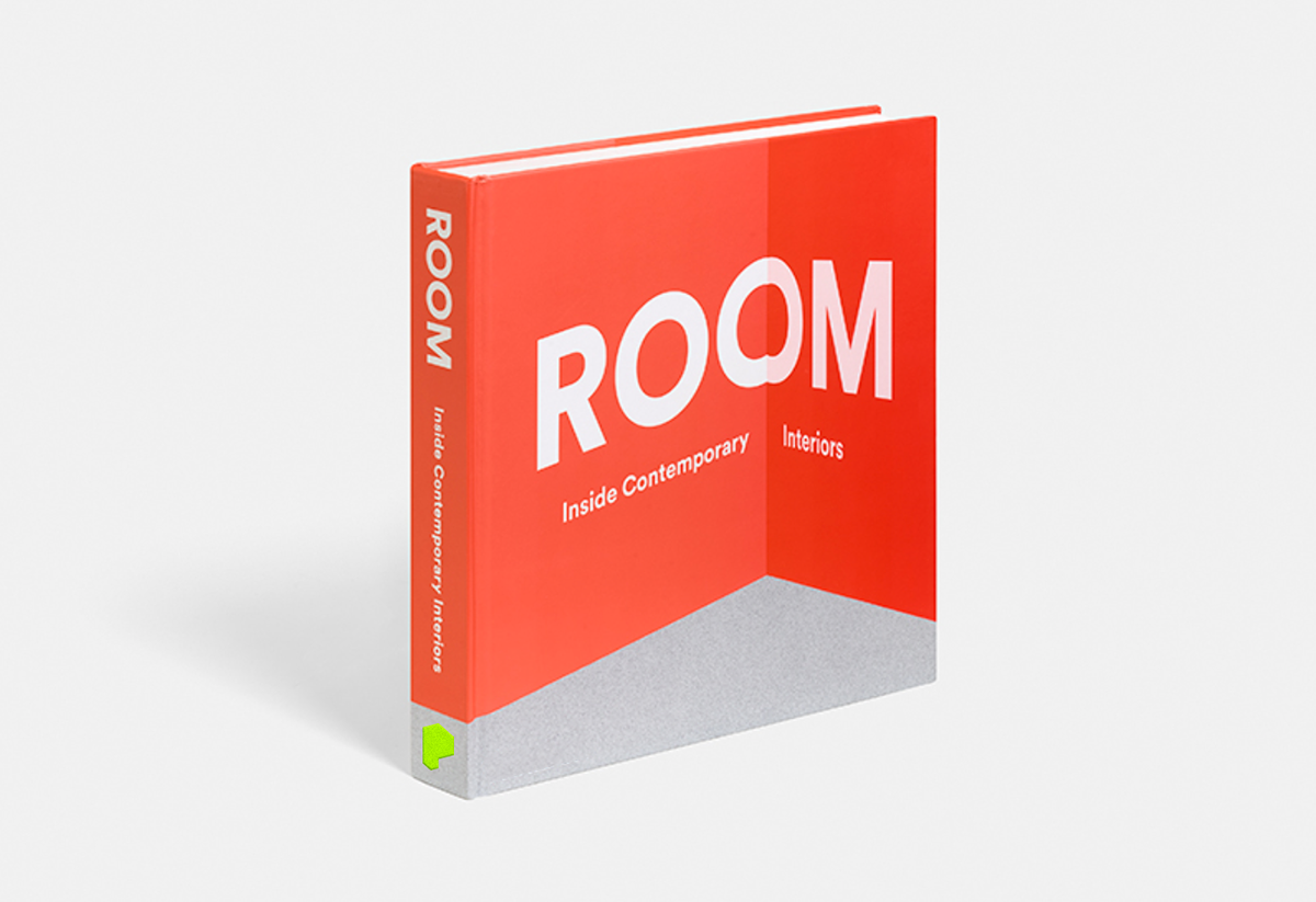
Applied across print and digital communications, the tone for the new identity is bold and unapologetic. The form of the iconic “P” allows for the identity’s migration to 3D space, where the wayfinding system also adopts aspects of the form. Carefully curated imagery is also important for this project as a way to communicate Phaidon’s great importance in the field of Visual Arts.
Special thanks to: Brad Bartlett